- Location: Kosovo . Pristina
- Senior Designer : Invert Studios
- Designer: Raouf Abdulnabi , Kamel Luqman Salem
- Materials supplier: Material Trade
- Area of :12000 square meters
- Year : 2021
- Photos: Courtesy of Invert Studios
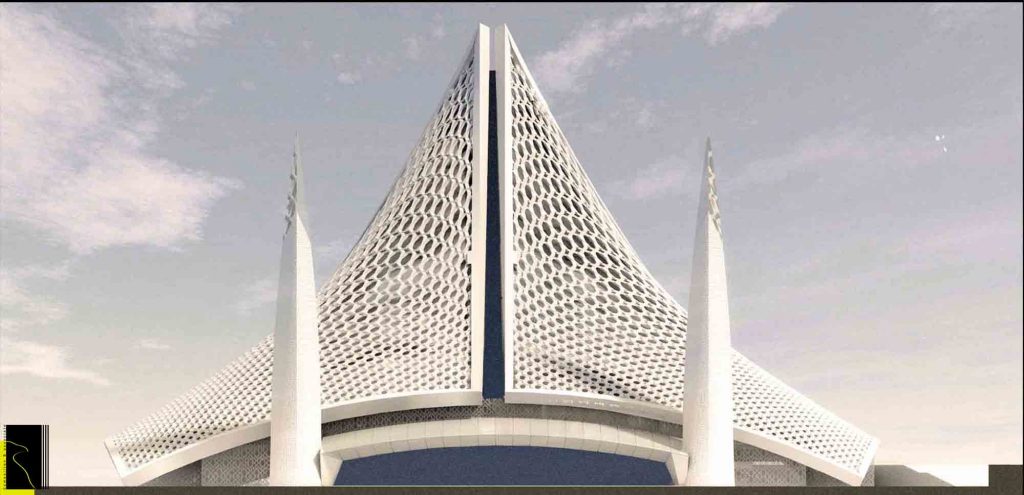
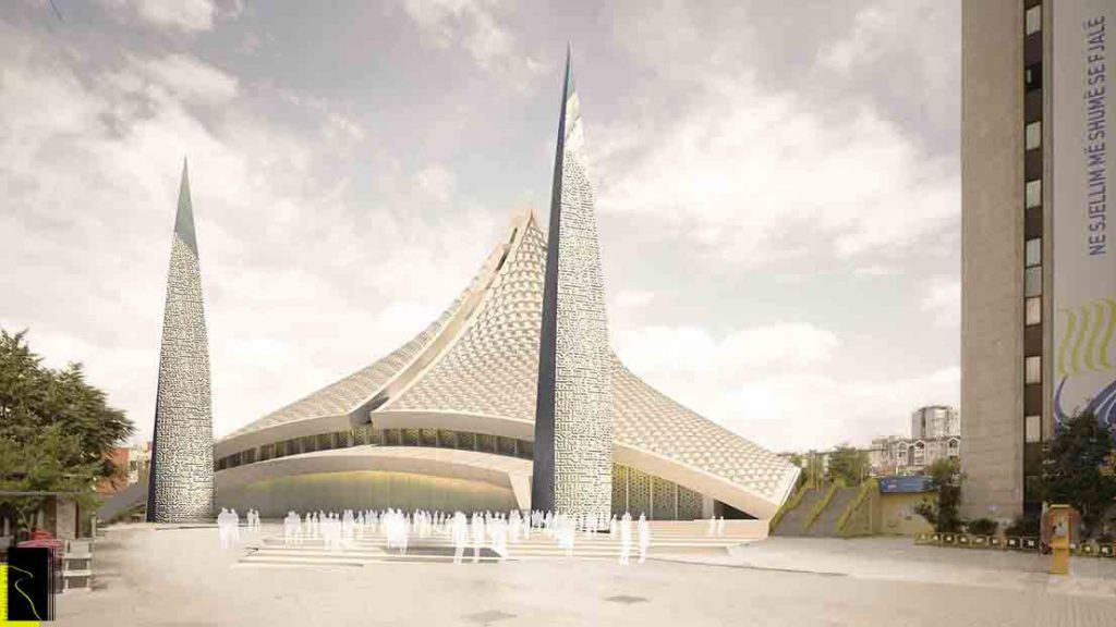
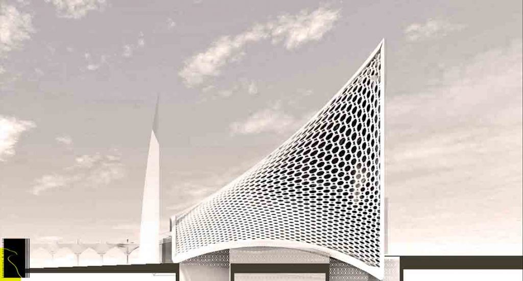
The idea behind the design by Invert Studios (Victoria Stotskaia, Raof Abdelnabi, Kamel Loqman) for the Central Mosque of Pristina started with a very simple question :How can we can design a building that should play in harmony with the surrounding neighborhood, integrated with the urbanity, and for a very powerful reason want to stand out as a futuristic icon for the city? By proposing a design that is not conventional and common, and in an effort to change the way the public perceives mosques external shapes, they created an example of a world class building that reflects the Islamic Architectural Heritage. At the same time, this building stands out with a high technology character.
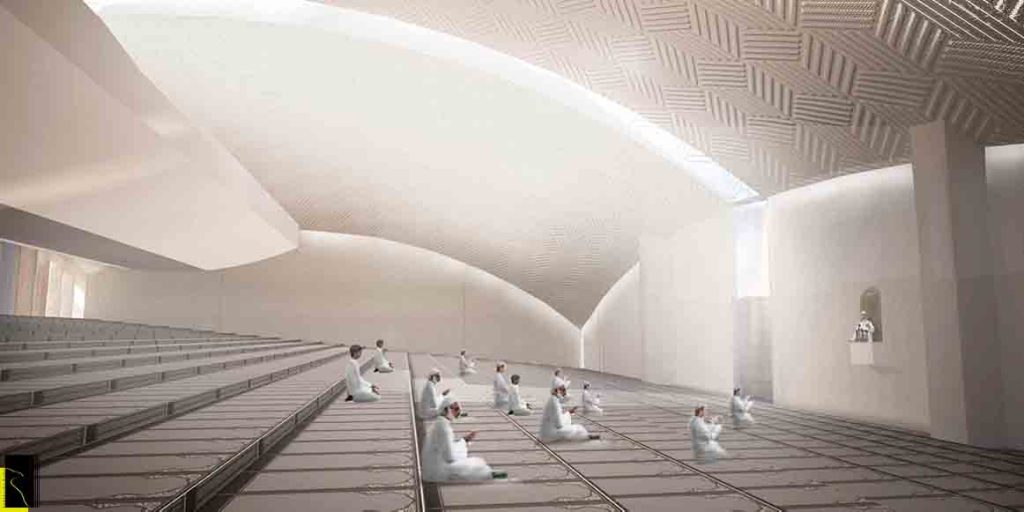
The Muslim community of the city of Pristina finds itself in a hard situation due to the lack of praying space and the disproportional mosque coverage between the old and the new part of the city. This situation is a consequence of the city growth during the socialist period where the sacral buildings were not a part of the urban planning agenda.
Mosques in Pristina are mainly located in the old (northern) part of the city and most of them remain from the Ottoman Period. Those are small masjids that have been planned for the neighborhood needs and a bigger one for the Friday prayers,. They are old and have cultural heritage values. Except of some new built mosques, the overall prayer space consists of the old ones which are actively being used by the city’s Muslim community. The deficient prayer space has resulted in a trend of building extensions to the existing mosques with the community’s intension to gain more space and even using the public spaces near them especially for the Friday prayers.
After the definition of the location from the Municipality of Pristina, the Islamic Community of the Republic of Kosovo emphasizing the importance of this Mosque as the Central one in the city took the decision of designing it through an International Competition. The consideration of building this Mosque as one with extraordinary importance to the Muslim Community of Kosovo, should serve as a crucial guide in the design process
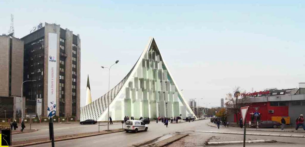
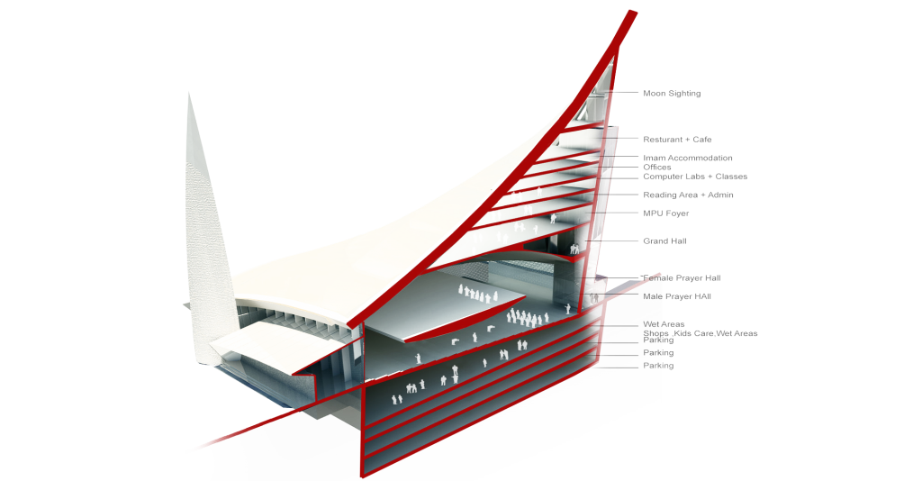
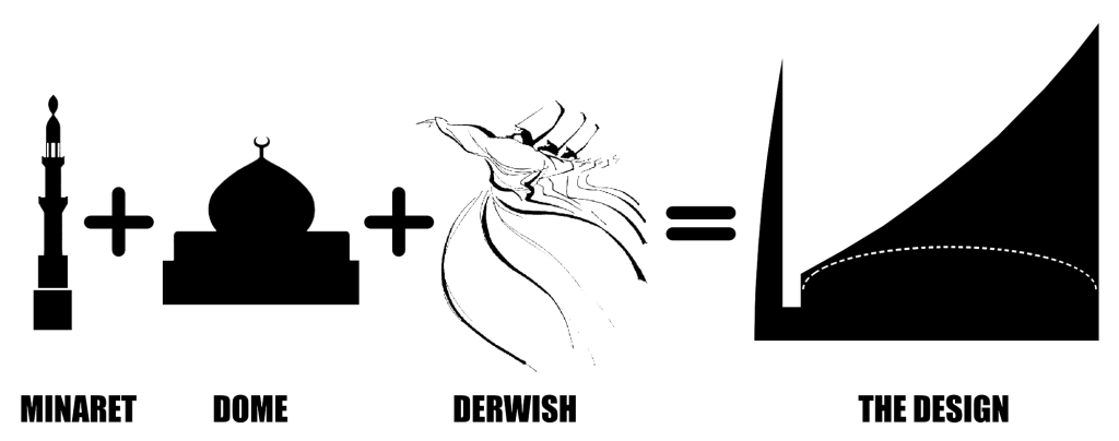
We looked at the Ottoman architectural elements, and simply we merged the two big elements that can make any building a mosque like shape, the Minarets and the Dome. we thought that if we can take the dome shape and merge it with the minaret and integrate the tower, where the most of activities will take place , and have a presence of this tower to the main road, we will be adding an iconic design for the Islamic Culture Center that will easily tie in with the urbanity of the site, and will interact with different directions of approaching points to it, from the main high road and the back lower road.
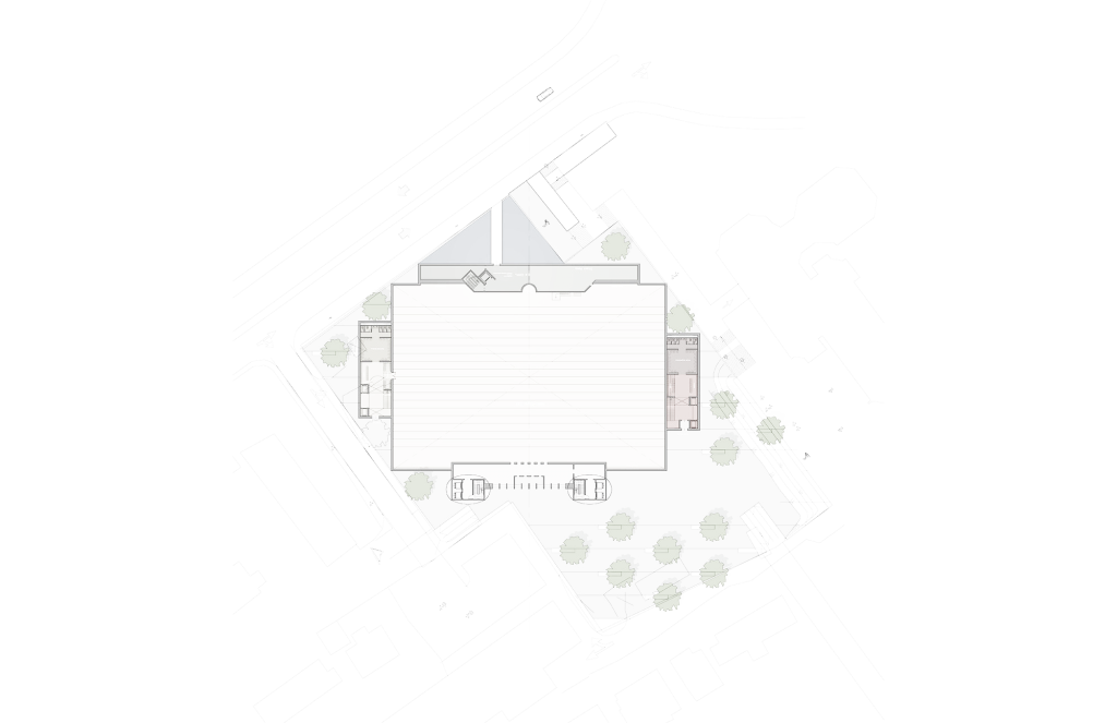
As the building is laid on the site with that specific angle, oriented to Mecca, that gives people passing in the street a very unique experience of how they will perceive the design from different angle, where they will always see the two different outstanding skins, the solid facing North, and the sofe transparent skin facing South.
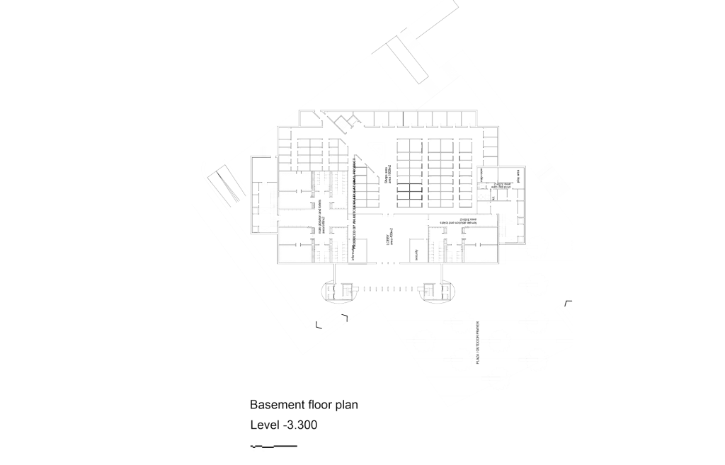
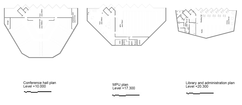
A major factor in the design was the movement of masses of population coming to the location of the project from different directions and levels. One main direction is expected to come from the west side of the site, shown in yellow arrow in the graphic, coming from the residential neighborhood. The other stream of people is expected to come from the main road, shown in orange arrow in the graphic, taking people to different activities happing on top of the prayer hall, in what we call the “glass tower”. We believe, the design team, that this will achieve the most efficient and simple circulation between the different activities and functions of the such a big cultural center, and making sure that all the spaces will play in harmony with the urbanity of the site.
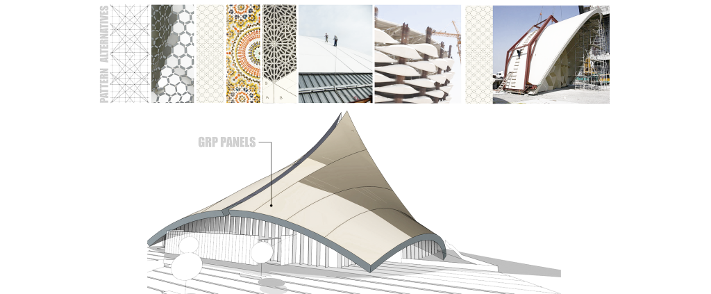
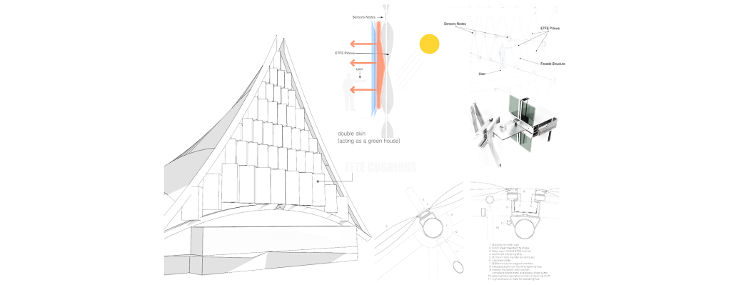
The public spaces has been stacked facing the main road and South. the facade has double skin, the external is ETEF cushions, and the inner one is glassing. By doing that, we achieved the idea of the green house, where the heat of the Sun and captured between the to skins, which will radiate into the spaces during the day.

